Re-branding Ho‘ōla Nā Pua
Ho‘ōla Nā Pua is an anti-sex trafficking non-profit in Hawaii. Their mission is the renewal of trafficked girls through health, education, advocacy, and reintegration. They approached me to give their brand a fresh, modern look.
Their old logo:

The scope of the rebrand:
- Primary Ho‘ōla Nā Pua Logo Redesign
- 2 sub-brand logos design
- S.T.A.R.F.I.S.H. Logo Design (Structured Treatment for Adolescents Referred Following Identification as Sexually trafficked in Hawaii)
- P.E.A.R.L.S. Logo Design (Providing Evidenced based intervention for Adolescents)
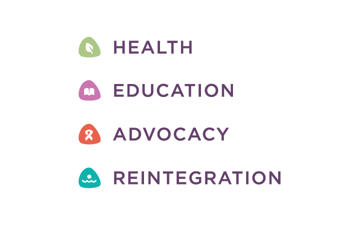
- 4 Core Pillar Philosophy logos designed
- Health
- Education
- Advocacy
- Reintegration
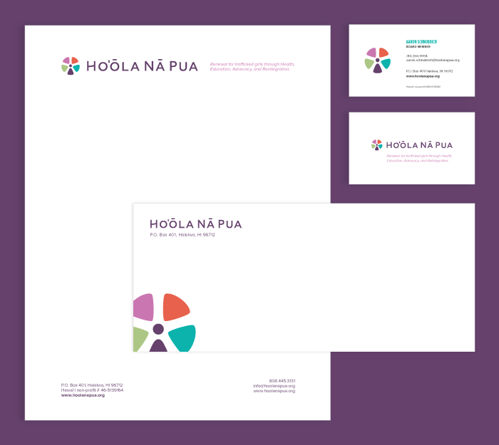
- Stationery Designed
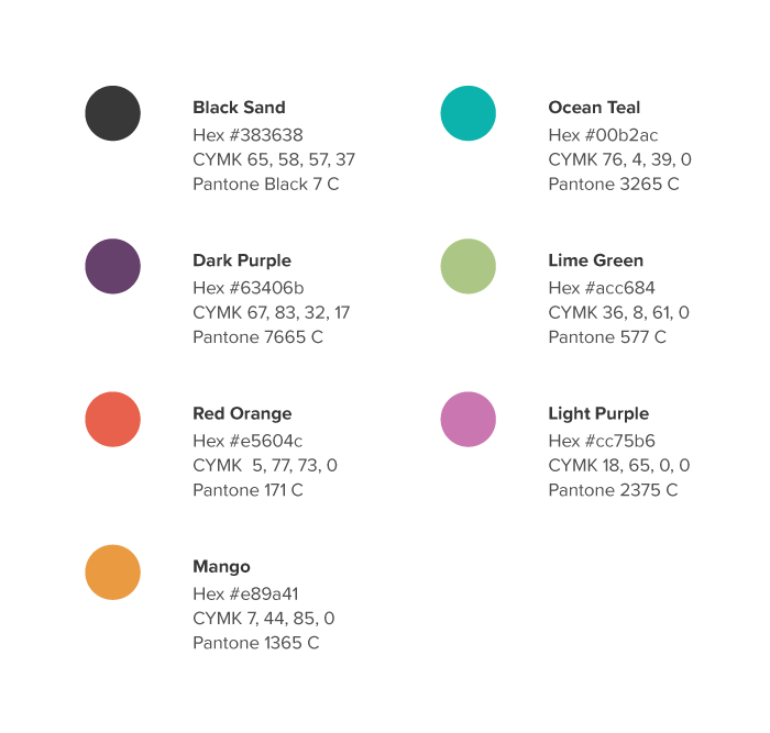
- Color Palette and Style Guide
The Process:
RESEARCH PHASE
I had the client fill out my questionnaire, I reviewed their mission statement, vision statement and their background story. Here are the key points of the research phase:
Meaning behind the name: The Hawaiian name Hoʻōla Nā Pua means “New Life for our Children.” Hoʻōla means healing and new life; pua means flower and is also a term of endearment when referring to children. The name culturally reflects their mission, and it closely identifies with and reflects Hawaiian values and social heritage.
Their Mission: Hoʻōla Nā Pua is committed to providing a home designed to meet the unique needs of underage female sex trafficking victims through the utilization of individualized, comprehensive, and restorative therapies.
At Hoʻōla Nā Pua, optimal health is holistic. This means healing of body, mind, spirit, and emotion is central in our restorative efforts and interventions so that a young girl is able to reach her full potential and live a healthy and successful life is committed to H.E.A.R (Health, Education, Advocacy, and Reintegration).
Primary adjectives the new logo should have: Organic, healing, safe, girl, loving, just, peace, safe, promising, holistic, natural.
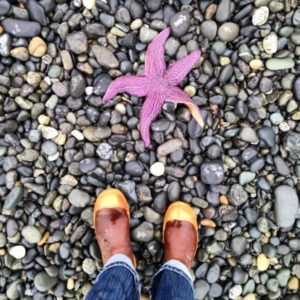 This story of the starfish has significant meaning for the brand in regards to making a difference:
The man asked the boy what he was doing, and the boy replied, "I am throwing these washed up starfish back into the ocean, or else they will die from lack of oxygen.”
“But,” said the man, “You can’t possibly save them all. There are thousands on this beach, and this must be happening on hundreds of beaches along the coast. You can’t possibly make a difference."
The boy looked down, frowning for a moment, then he bent down to pick up another starfish, smiling as he threw it back into the sea. He replied:
“I made a huge difference to that one!”
(Adapted from “The Star Thrower”, by Loren Eiseley)
Research of other partners in the same field of anti-sex trafficking:
SKETCHING PHASE
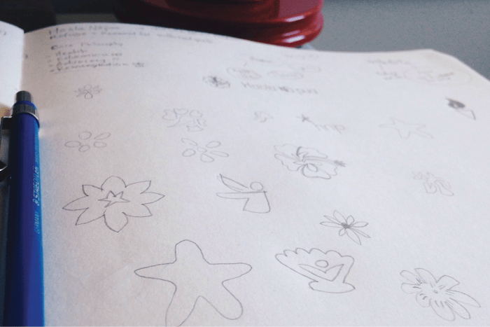
Once the key objectives were established, pages were filled on the sketchpad of ideas, brainstorming, and some mind mapping. Once I had enough ideas I felt were strong and appropriate, I moved onto the vectorization and presentation stage.
VECTORIZING & PRESENTATION PHASE
I developed several concept for the client to consider. I felt the strongest ideas played off of the idea of a flower, starfish or girl in some way.
Sample of concepts/ideas presented to client in round 1:

REVIEWING & DECIDING PHASE
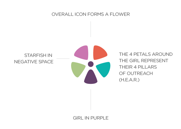
Upon review, the client and I decided the strongest option was the idea of a young girl being integrated into a flower with a starfish subtly being in the negative space, with the 4 core pillars of the brand (Health, Education, Advocacy, and Reintegration) being the 4 flower petals around the girl.
Unrefined original concept:

REFINEMENT PHASE
We then went onto refine the concept. After several rounds of tweaking, we came to the finalized icon and a fresh Hawaiian-inspired color palette.
Finalized, refined icon:
![]()
Explanation of refined icon concept:
Customized typography added to icon:
Designing Sub-brands
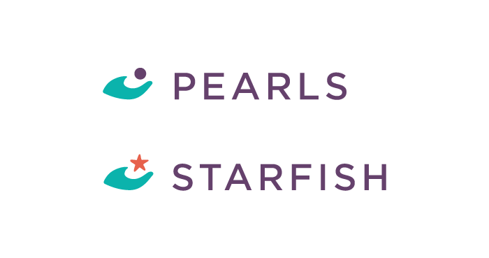
For the STARFISH programs, I took the idea of a hand holding a starfish, with the hand also subtly representing the wave. And for the PEARLS program, I replaced the starfish with a pearl.
Sub-brand logos:
And then, in theme with the 4 petals around the logo, I made the icons for the four pillars all in the shape of the flower petals from the logo:
Designing Collateral
Once the colors, fonts, and logos were finalized, I moved onto designing a full stationery set:
Designing Style Guide
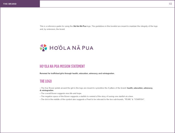
A full style guide was designed. See link to full PDF here.
Sample page from style guide:
 You can see the full re-brand integrated and find more information about Ho‘ōla Nā Pua on their website. It was meaningful to do the rebrand for an organization providing such a desperately needed outreach to these abused girls in Hawaii.
Thanks for taking a look, and let me know your thoughts on the re-brand. I'm currently booking new projects so contact me if you need any branding work done!
Cheers,
Josiah

