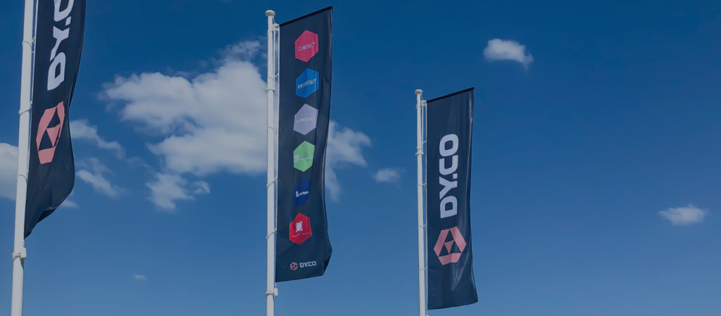
DY.CO
DY.CO is home to some of the most trusted and respected products and brands within the European construction and reinforced concrete sector.
I worked with Filip Matous (matous.com) and the AIDA team from London, UK. My role was to design the logo for the primary DY.CO brand, and then re-brand the 6 product logos; all of which had very different styles, and in some cases, a 60-year history.
The DY.CO Logo Process

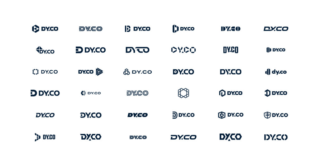
We landed on a custom type paired with an icon depicting multiple elements coming together to form an abstract “D” within a hexagon shape. The hexagon shape is associated with the honeycomb, which is the strongest structure/shape known.
The clean geometric elements give the icon a strong, construction vibe.

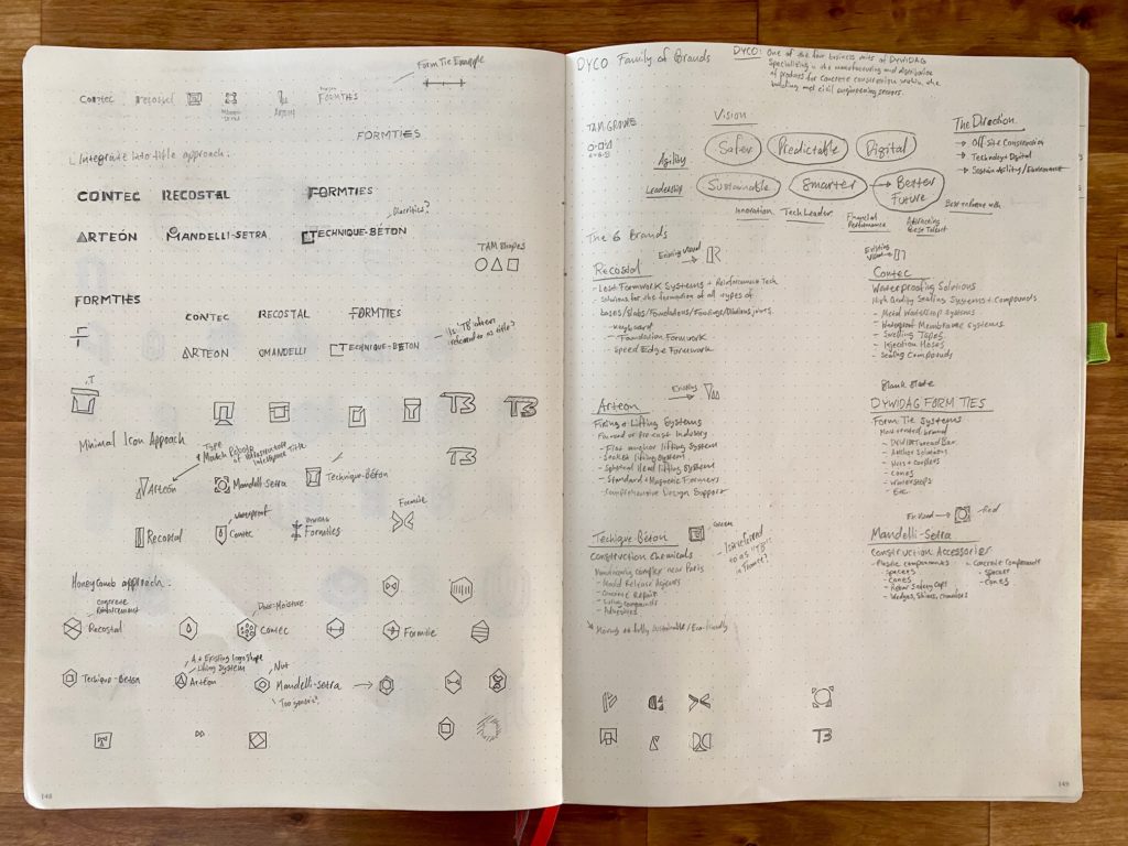
The 6 Sub-brands (old logos):

The goal was to re-brand all the sub-brands in a way that retained recognition of their existing brand and history, yet be cohesive to the new DY.CO brand.
The updated sub-brand logos.

We leveraged off the hexagon shape for all the logos, and found ways to retain existing colors, and in some cases existing shapes from the original logos.