
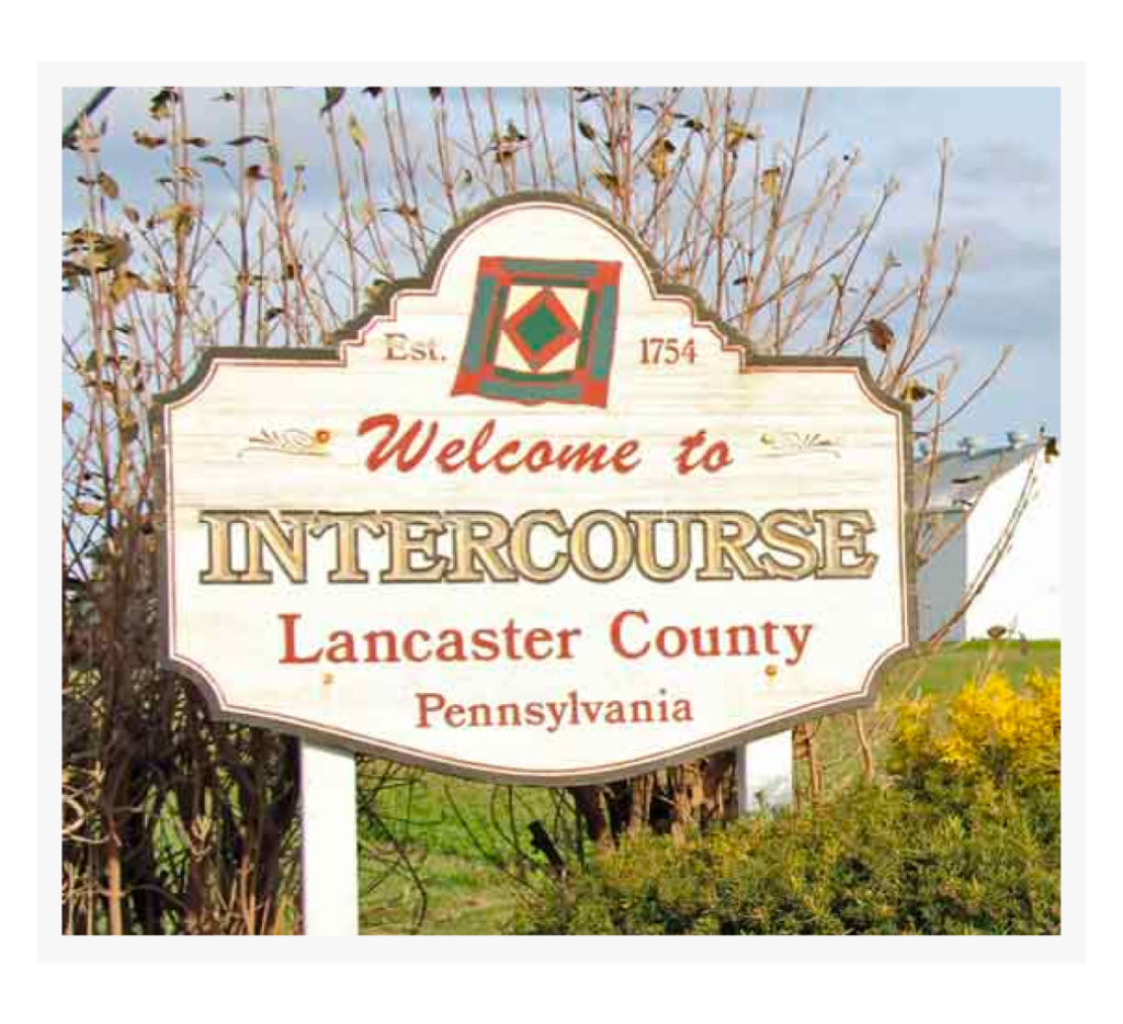
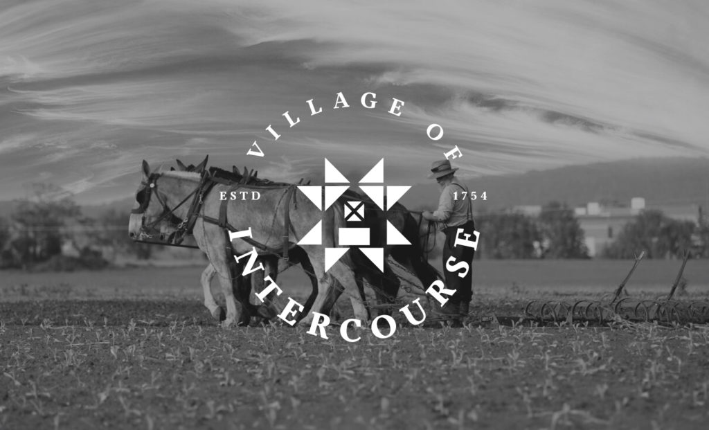
Intercourse, Pennsylvania

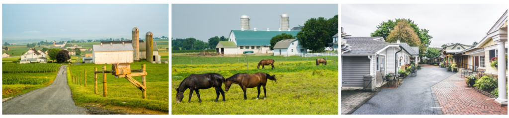
Intercourse, Pennsylvania. What an exciting name for a village founded in 1754. When it comes to town names, I gotta say, the Pennsylvania pioneers came up with some doozies like Intercourse, Blue Ball, and Bird in Hand. Intercourse is a fun, touristy town with a rich heritage in Amish farming, craftsmanship, and a tight-knit community. The town has a unique section called “Kitchen Kettle Village” with 40+ shops that sell handmade crafts, quilts, foods, etc.
I was approached to re-brand their village logo with the goal of having more appeal to younger families and the next generation. Some people may ask why they aren’t re-branding their name, too? They have come to embrace their name and heritage and the giggles it brings. Also, “intercourse” meant conversation back in 1754. Nowadays it’s “less talk, more action.”
Creative Process
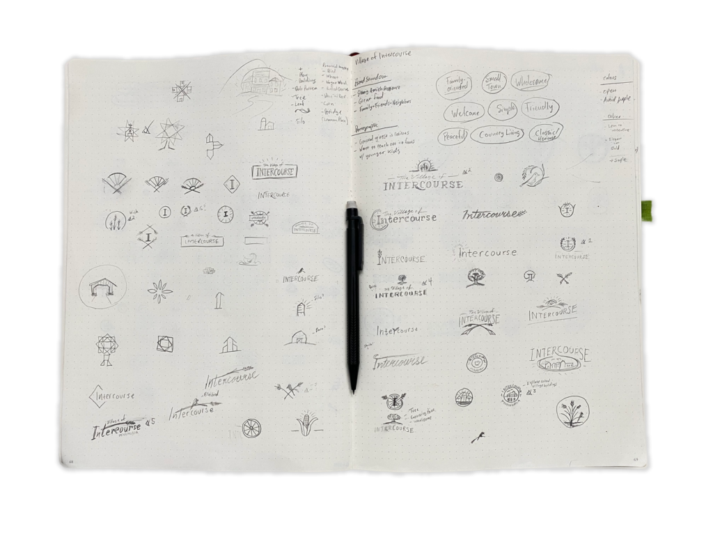
The heart of the creative process for me always involves writing the core elements of the brief with pencil and paper on my Leuchtturm1917 dotted sketchpad. I then aim for 100+ sketches. With an entity like ‘Intercourse’, it was necessary to look at my sketches with perverted eyes to make sure it wasn‘t *cough* misinterpreted (Uh, can’t do the cornstalk idea… and nope, that silo concept is definitely a no-go).
The Concepts
For this project, once I had the 5-6 ideas on paper that I felt resonated with the brand, I then moved onto creating the presentation of concepts for the client.
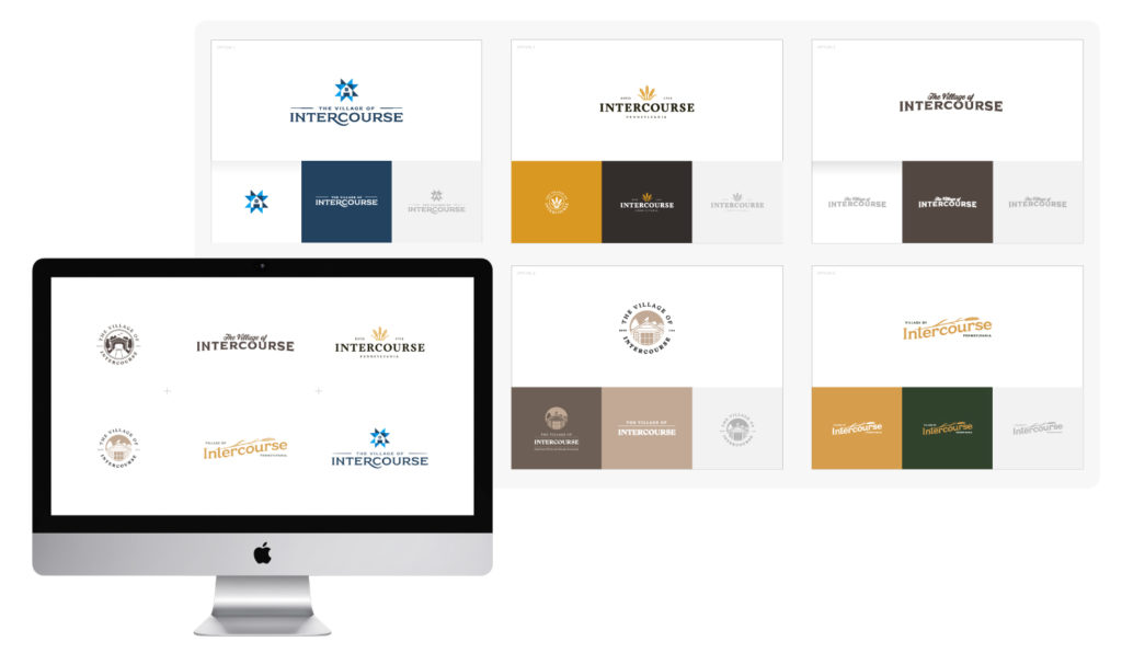
Chosen Direction
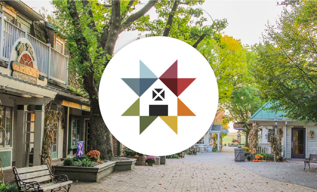
The client/town board and I both felt the strongest direction was the colonial quilt pattern with barn in the center. It captured the sense of community, Amish-heritage, and the fun, clean colors and shapes make the logo more inviting for young families.

Final Delivery
For the final logo we chose Quieta font family. The serif is friendly, legible, and in style with the town’s heritage.
Hope you enjoyed a peep into my process for Intercourse and that you found the solution satisfying.
Thanks for your time!
